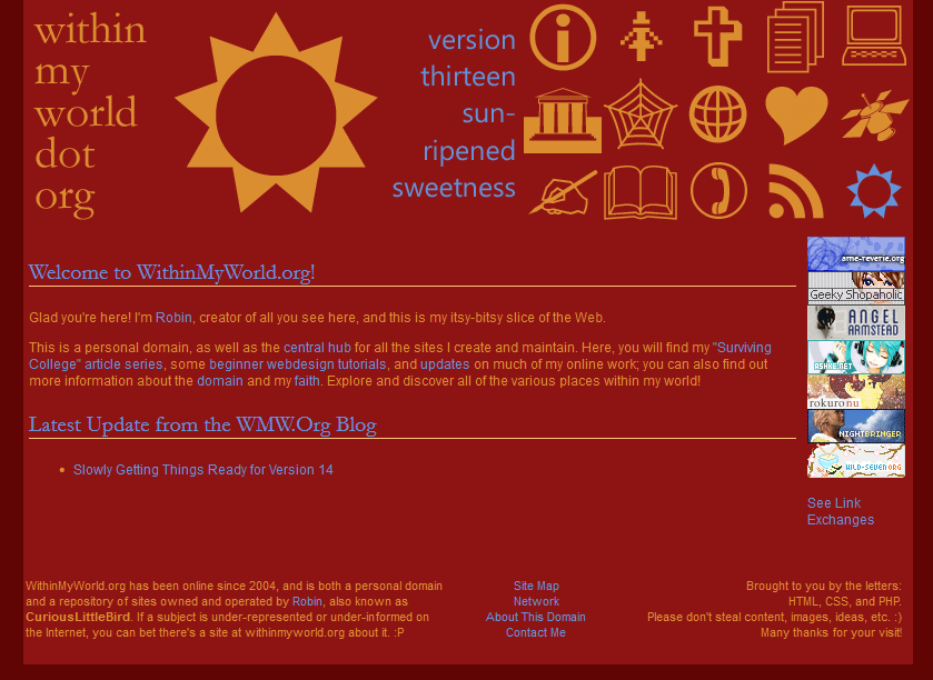
Combined small header image and icon-based navigation at top of page
Two columns below header bar for content and affiliate buttons
New Techniques
Working with a VERY different color scheme than I'm used to
Making and using just icons as navigation
Trivia
This layout's unusual color scheme was the result of a happy accident--I had intended version 13 to be red and pale orange, but I accidentally started using a bright periwinkle blue left over from my last project in Photoshop. But instead of hitting "Undo," I fell in love with the color contrast, and ran with it instead!
Though I didn't know it at the time, version 13 mostly fits in with flat design theory, because of all its minimalistic icons and bright colors.
If I were to do this layout over, I would not use red as the background color, especially behind the content--that design choice received a lot of visitor complaints, since red is hard on the eyes after a while.
I didn't expect to like this experimental layout as much as I did, because I don't generally like red that much. But it turned out pretty well!